Color Contrast Strategies: 4 Formulas for Maximum Street Visibility
Advertisements
Strong color contrast strategies can make layered street-art lettering easier to read by separating fills, outlines, shadows and highlights from one another.
There is no universal color formula that guarantees legibility at exactly 50 yards, because distance, letter size, lighting and background all matter.
The four approaches below offer practical starting points for murals, legal walls and lettering practice where clarity and visual impact are important.
Why Contrast Matters in Layered Lettering
Layered lettering becomes difficult to read when adjacent colors share similar brightness, saturation or visual weight across the composition.
Clear separation between the fill, outline and surrounding surface helps the viewer recognize letter shapes before noticing smaller decorative details.
This makes contrast a structural tool rather than simply a way to create brighter or more dramatic color combinations.
Contrast Supports Letter Recognition
The eye identifies large shapes and edges before processing many smaller decorative details, especially when the design is viewed from farther away.
A clearly separated outline can therefore preserve the silhouette of letters even when interior colors become less distinct at distance.
For this reason, readable lettering often depends more on strong edge definition than on using the maximum possible number of bright colors.
Brightness Difference Is Especially Important
Two colors can differ greatly in hue while still appearing surprisingly similar when converted mentally or digitally into grayscale.
A light fill against a dark outline usually creates clearer separation than two equally bright colors placed directly beside each other.
Checking a sketch in grayscale can help reveal whether the design depends too heavily on hue instead of brightness contrast.
Compare the fill and outline in grayscale.
Avoid placing similar-value colors on adjacent edges.
Use the strongest contrast around the main letter silhouette.
Reserve subtle combinations for internal details.
Distance Changes What the Viewer Sees
Fine details disappear progressively with distance, leaving larger shapes, broad color fields and strong edges as the dominant visual information.
A design that looks highly detailed from several feet away may simplify dramatically when viewed from across a street or large open space.
That is why long-distance readability depends on scale and letter construction alongside any chosen color contrast strategies.
There Is No Guaranteed 50-Yard Formula
The original article treated 50-yard readability as though color combinations alone could produce a predictable viewing result.
In practice, letter height, viewing angle, visual obstructions, eyesight, motion and lighting conditions all change how far lettering remains recognizable.
Color formulas should therefore be treated as design frameworks rather than scientifically guaranteed distance thresholds for every artwork.
Test Designs at Multiple Scales
A useful way to evaluate lettering is to view the sketch from progressively farther away or reduce it significantly on a screen.
If the main letter structure remains recognizable at smaller scale, the outline and overall silhouette are probably doing their jobs effectively.
If the design collapses into one visual mass, increasing edge contrast or simplifying internal detail may improve clarity.
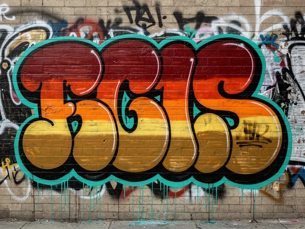
Formula 1: Light Fill With a Dark Outline
The simplest contrast formula places a relatively light fill inside a substantially darker outline, creating immediate edge definition around each letter.
This approach works because the viewer can identify the overall silhouette before needing to interpret interior shadows, highlights or secondary decoration.
It is especially useful when the surrounding wall already contains multiple colors, textures or marks that could compete with the lettering.
Black Is Useful but Not Mandatory
Black provides strong separation against many light and medium fills, making it a common outline choice for graphic lettering.
However, deep navy, dark brown, burgundy or another sufficiently dark color can provide a softer alternative while retaining strong value contrast.
The important factor is the difference in brightness between layers rather than adherence to one mandatory outline color.
White Can Reverse the Formula
A bright white or pale outline can work effectively around darker fills, especially when the surrounding surface is also relatively dark.
This reverse treatment creates a luminous edge that separates the lettering without requiring a black contour around every form.
It can also support cleaner or more graphic compositions where heavy dark outlines would visually overpower the interior colors.
Formula 2: Complementary Hues With Value Control
Complementary colors sit opposite one another on a traditional color wheel and can create energetic visual separation when paired carefully.
Examples include blue with orange, red with green and yellow with violet, although the exact result changes with saturation and brightness.
Complementary hue alone does not guarantee readability, so one color should usually be lighter or darker than the other.
Blue and Orange Can Create Strong Separation
A medium or dark blue outline around a lighter orange fill can create both hue contrast and useful brightness difference.
If both colors are equally bright, however, their edge may vibrate visually without producing the cleanest possible letter definition.
Adjusting one toward a darker or lighter value usually makes the combination easier to interpret from a greater distance.
Control Saturation to Avoid Visual Noise
Using maximum saturation in every layer can make a composition feel visually aggressive and reduce hierarchy between primary and secondary elements.
One saturated color combined with a more muted complement often creates a clearer focal point than two equally intense hues competing together.
This balance can preserve energy while allowing the outline, shadow and highlights to perform distinct visual functions.
Choose one dominant complementary color.
Adjust brightness between the fill and outline.
Reduce saturation when both colors compete strongly.
Keep secondary accents smaller than the main color fields.
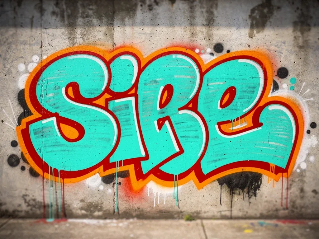
Formula 3: Analogous Fill With a Contrasting Outline
Analogous colors sit near each other on the color wheel and create a smoother, more unified appearance inside a layered design.
Because their hue contrast is relatively limited, a stronger outer outline can preserve readability around the combined interior treatment.
This creates a useful balance between visual harmony inside the letters and stronger structural separation around the outside.
Use Similar Hues Inside the Letter
Blue, cyan and green can form an internal palette that feels related while still creating enough variation for depth or gradient effects.
Warm palettes can use combinations such as red, orange and yellow when the design benefits from a more energetic internal treatment.
The exact hues matter less than maintaining enough edge contrast between that internal palette and the final outer contour.
Let the Outline Carry the Readability
A dark neutral or strongly contrasting hue can frame analogous interiors and prevent them from merging into the background.
This allows artists to experiment with subtler gradients or internal layers without sacrificing the broader silhouette of the lettering.
The approach works particularly well when the interior is decorative but the exterior shape must remain immediately recognizable.
Formula 4: Monochromatic Layers With One Accent
A monochromatic scheme uses lighter and darker versions of one base hue, producing a cohesive look across fills, shadows and highlights.
One sharply contrasting accent can then define the outer edge or another important structural feature of the lettering.
This formula reduces color competition while still creating a clear focal point around the most important part of the design.
Use Tone to Create Internal Depth
A blue design might move from pale cyan highlights through medium blue fills into deep navy shadows while remaining visually unified.
The gradual tonal relationship can suggest volume without introducing several unrelated hues that compete for equal attention.
That internal hierarchy becomes even clearer when the outer contour uses a contrasting accent such as orange or warm yellow.
Keep the Accent Focused
An accent color becomes less effective when it appears everywhere because the viewer no longer knows which edge or detail deserves attention first.
Using it selectively around the main outline or critical highlights creates stronger hierarchy and makes the monochromatic layers easier to read.
This restraint is particularly useful in multi-layer designs where too many competing colors could otherwise flatten the entire composition.
Triadic Palettes Can Work With Care
Triadic schemes use three hues positioned at roughly equal intervals around a traditional color wheel, creating a lively but balanced palette.
Examples include red, yellow and blue or orange, green and violet, though brightness relationships still determine whether the layers remain clear.
These combinations work best when one color dominates and the other two support it instead of occupying equal visual weight.
Assign Each Color a Specific Role
One color can serve as the primary fill, another as the outline and the third as a limited shadow or highlight.
This role-based approach prevents the scheme from turning into three equally loud fields competing across the same visual area.
Reducing the saturation or brightness of one supporting hue can also create a stronger sense of depth and order.
Avoid Equal Visual Weight Everywhere
When three highly saturated colors occupy similar areas, the composition can become harder to read because no layer appears dominant.
A clearer hierarchy usually comes from assigning most of the visual space to one color and limiting the other two.
This keeps the palette energetic while allowing the lettering structure to remain more important than the color system itself.
Background Color Changes the Best Choice
A combination that works on pale concrete may behave very differently on dark brick, painted metal or a highly textured authorized wall.
Background color effectively becomes another layer in the design and should be considered before selecting the primary fill and outline.
Ignoring the surface can reduce separation even when the colors work well together on a white sketchbook page.
Dark Backgrounds Favor Lighter Edges
On a dark surface, pale outlines and brighter fills can create the separation needed to keep letter boundaries visible.
A dark outline may disappear into the wall unless another lighter keyline or border separates it from the surrounding surface.
Testing a small mock-up against a photograph of the wall can help reveal this problem before the final artwork is produced.
Light Backgrounds Favor Darker Structure
On a pale wall, a darker outline often creates clearer letter boundaries than a similarly light contour placed against the surface.
Bright fills can still work, provided the border has enough contrast to prevent the whole design from merging with the background.
This is another reason why edge definition often contributes more to readability than simply selecting the brightest possible paint.
Lighting Changes Color Perception
Daylight, shade and artificial lighting can change how bright or saturated the same painted surface appears to the viewer.
A palette that feels highly separated in direct sunlight may become flatter under weak evening illumination or warm-colored street lighting.
For permanent legal murals, checking the wall under more than one lighting condition can produce a more reliable design decision.
Daylight Usually Reveals More Color Difference
Bright daylight makes hue and saturation differences easier to perceive because the viewer receives more reflected light from the painted surface.
This can make subtle internal color transitions visible even when those same transitions become less obvious later in the evening.
Designs intended to remain recognizable after dark should rely more heavily on strong light-dark structure than on subtle hue differences.
Artificial Light Can Shift the Palette
Warm or cool artificial lighting can alter the apparent color balance, especially in pale neutrals and closely related hues.
Red, orange and yellow may appear more dominant under some warm sources, while blues can feel less saturated in certain conditions.
Testing under realistic lighting is therefore more reliable than judging the final palette entirely under studio or phone-screen conditions.
Outlines Do More Than Separate Colors
The outline defines the external shape of a letter and often carries much of the responsibility for preserving readability across distance.
Its thickness, continuity and contrast can make a complicated interior treatment easier to understand as one unified letterform.
An inconsistent outline can weaken a strong palette because the viewer loses a clear structural boundary around the main design.
Thicker Is Not Always Better
A very thick outline may improve separation but can also consume negative space and alter the intended proportions of individual letters.
A thinner contour preserves more internal area but may disappear when viewed from farther away or against a visually busy wall.
The best thickness depends on overall letter size, spacing and viewing conditions rather than one universal ratio.
Drop Shadows Can Add Separation
A drop shadow can make lettering appear detached from the background by creating a secondary edge offset from the main form.
Darker shadows are common, but the important factor is ensuring that the shadow remains visually distinct from both the outline and surface.
Used carefully, this layer can add depth without requiring additional interior colors that might complicate the primary letter structure.
Keep the Shadow Direction Consistent
A consistent shadow angle makes multiple letters feel connected and helps the viewer understand the intended three-dimensional effect quickly.
Changing direction randomly between letters can weaken the illusion and make the design feel less coherent despite strong color choices.
Simple geometry often produces better distance readability than highly detailed shadow effects with several competing edges.
Highlights Should Support Form
Highlights can suggest light catching the edge of a painted letter and add another level of depth to a layered composition.
They work best when placed selectively rather than tracing every edge, because excessive highlights can create another competing outline.
A lighter version of the fill or a neutral highlight is often sufficient to create definition without introducing another unrelated hue.
Use Highlights on Important Curves
Placing highlights along selected upper or outer edges can emphasize curves and directional changes within the letter structure.
This can make rounded forms feel more dimensional while still allowing the main outline to remain the strongest readability element.
Consistency in highlight placement also helps the viewer interpret the same implied light direction across the entire piece.
Color-Blind Accessibility Is Worth Considering
Some viewers distinguish particular hue combinations less easily, especially when colors differ in hue but remain similar in brightness.
Strong light-dark separation helps preserve readability even when a viewer does not perceive the intended hue relationship exactly as designed.
This is another reason why luminance structure remains useful alongside complementary, analogous or triadic color theory.
Do Not Depend on Red-Green Contrast Alone
Red and green can appear highly different to many viewers but may provide weaker distinction for some forms of color-vision deficiency.
Making one color substantially lighter or darker than the other can preserve edge separation even when the hue contrast is reduced.
Grayscale testing offers a simple way to check whether the structure remains legible without depending entirely on color perception.
Legal Walls Are Ideal for Testing Color Systems
Authorized murals, community art walls and studio panels provide controlled environments where artists can study color without legal or property concerns.
They also allow more time for measuring proportions, comparing alternatives and viewing the finished lettering from different distances.
This makes them especially useful for testing whether a complex layered design actually remains clear outside a sketchbook or digital screen.
Create a Small Color Study First
A reduced color study can reveal whether the outline disappears, whether an accent overwhelms the fill or whether the background competes excessively.
Photographing the test and viewing it at thumbnail size provides another quick approximation of how large shapes survive visual reduction.
These tests cost less time and material than changing a full-scale mural after discovering that the layers lack sufficient separation.
Four Practical Contrast Formulas
The strongest takeaway is that there are several useful ways to organize color without pretending any one combination guarantees a specific viewing distance.
Each formula below prioritizes structural separation first and decorative complexity second, making the system easier to adapt to different surfaces.
They can also be combined selectively when a larger legal mural or lettering study requires more than one visual hierarchy.
Formula Summary
Formula one uses a light fill and dark outline, creating the simplest and most reliable brightness contrast between adjacent layers.
Formula two combines complementary hues with controlled brightness, while formula three pairs analogous interiors with a stronger external outline.
Formula four uses monochromatic depth with one accent, producing a cohesive interior while preserving one highly visible focal edge.
Color Formula | Primary Visual Function |
|---|---|
Light Fill + Dark Outline | Creates strong brightness separation around the main letter shape. |
Complementary Hues | Adds energetic hue contrast when brightness is also controlled. |
Analogous Fill + Contrast Outline | Keeps the interior harmonious while the outer edge preserves readability. |
Monochromatic + Accent | Creates tonal depth with one focused color providing emphasis. |
Frequently Asked Questions About Color Contrast in Street-Art Lettering
Can a color formula guarantee readability from 50 yards?
No. Distance readability also depends on letter size, outline thickness, lighting, background, viewing angle and the visual environment.
What is the safest starting point for strong contrast?
A light fill with a substantially darker outline, or the reverse, usually provides a straightforward way to create clear edge separation.
Are complementary colors always the most readable?
No. Complementary hues can still have similar brightness, so adjusting lightness or darkness is often necessary for stronger readability.
Why should I test a design in grayscale?
Grayscale helps reveal whether the design has enough brightness contrast without relying only on differences between hues.
Do drop shadows improve readability?
They can improve separation from the background when used consistently, but overly complicated shadows may make the design harder to read.
Can these strategies work for murals and legal graffiti?
Yes. The same principles apply to authorized murals, lettering practice, canvases and other permitted street-art environments.
Do urban backgrounds affect color choice?
Yes. Wall brightness, texture and surrounding colors effectively become part of the composition and should influence the final palette.
Conclusion
Effective color contrast strategies combine brightness, hue, scale and edge definition rather than relying on color-wheel formulas alone.
Complementary, analogous, monochromatic and high-value-contrast palettes can all work when each layer has a clear visual role within the lettering.
Testing designs on legal surfaces and at multiple viewing distances remains the most reliable way to refine readability and visual impact.