Graffiti Art & Color Theory: Using Complementary Colors for Eye-Catching Murals
Applying color theory, specifically the strategic use of complementary colors, allows graffiti artists to create visually striking and dynamic murals that captivate audiences and enhance urban landscapes.
Delving into the vibrant world of urban art, the strategic application of color is paramount for creating impactful pieces. Understanding how to use the principles of Graffiti Art and Color Theory: How to Use Complementary Colors to Create Eye-Catching Murals can elevate a simple street painting into a compelling visual statement, ensuring your work truly stands out in any environment.
The foundational principles of color theory in urban art
Color theory serves as the backbone for any visual art form, and graffiti is no exception. Its principles provide a framework for understanding how colors interact, affect perception, and evoke emotions. For graffiti artists, mastering color theory is not about rigid rules, but about understanding a powerful toolkit to enhance their creative expression.
In the urban landscape, where murals compete for attention, a deep comprehension of color interactions becomes critical. Artists can utilize subtle nuances or bold contrasts to dictate the mood, focal points, and overall narrative of their work. This involves more than just picking favorite shades; it’s about intentional design rooted in established visual psychology.
Understanding the color wheel and its segments
At the core of color theory lies the color wheel, a visual representation of colors arranged according to their chromatic relationship. This seemingly simple tool is invaluable for artists, providing a clear map of primary, secondary, and tertiary colors, and illustrating their connections. It’s especially useful for identifying harmonious pairings and impactful contrasts.
- Primary Colors: Red, yellow, and blue are the foundational hues from which all other colors are derived, forming the primary building blocks of any palette.
- Secondary Colors: Created by mixing two primary colors (e.g., red + yellow = orange; yellow + blue = green; blue + red = violet), these expand the artist’s foundational palette.
- Tertiary Colors: Formed by mixing a primary and a secondary color (e.g., red-orange, blue-green), these offer a vast spectrum of subtle and complex shades, adding depth and sophistication.
The practical application of the color wheel in graffiti extends beyond mere identification. It guides artists in selecting palettes that resonate with their message, ensuring vibrancy and legibility from a distance. The choice between warm tones that advance and cool tones that recede can profoundly influence how a mural is perceived, drawing the viewer’s eye to key elements or creating a sense of dynamic movement.
Moreover, understanding color temperature—the inherent warmth or coolness of a color—is crucial. Warm colors like reds, oranges, and yellows tend to evoke feelings of energy and passion, appearing to jump forward from the surface. Cool colors, such as blues, greens, and violets, often convey calm and spaciousness, tending to recede into the background. Graffiti artists can strategically use these properties to create depth and emphasize certain parts of their artwork, generating a dynamic visual experience.
Ultimately, a solid grasp of color theory empowers graffiti artists to make informed decisions about their palette. It allows them to move beyond instinct, crafting murals that are not only visually appealing but also strategically designed to leave a lasting impression on their audience.
The power of complementary colors: A comprehensive guide
Complementary colors are pairs of colors that are directly opposite each other on the color wheel. When placed side-by-side, they create the strongest possible visual contrast, enhancing each other’s vibrancy and creating a dynamic, eye-catching effect. This powerful interaction is a cornerstone for creating impactful graffiti murals.
Examples of complementary color pairs include red and green, blue and orange, and yellow and purple. The intensity of this contrast is what makes them so effective in art, particularly in urban environments where murals need to grab attention and stand out against busy backdrops.
How complementary colors create visual impact
The secret to the impact of complementary colors lies in their inherent opposition. Our eyes perceive these pairs as having maximum difference, leading to a visual vibration that is incredibly stimulating. This effect can make a mural feel more energetic, dramatic, and vivid, drawing the viewer’s gaze and holding their attention longer.
- Enhanced Vibrancy: Placing a bright orange next to a deep blue makes both colors appear more saturated and vibrant than if they were seen in isolation. This optical illusion can make colors truly pop.
- Dynamic Contrast: The stark difference between complementary colors creates a sense of movement and excitement within the artwork, preventing it from appearing flat or monotonous. This is essential for large-scale murals that need to communicate effectively across distances.
- Balanced Energy: While creating high contrast, complementary colors also tend to balance each other visually when used correctly. One color might dominate, but the presence of its complement provides a cohesive visual anchor.
Artists can use complementary colors not just for bold statements, but also for more subtle effects. For instance, using a small amount of a complementary color as an accent can highlight a specific detail without overwhelming the piece. This technique adds depth and complexity, demonstrating a sophisticated understanding of color interaction.
Moreover, the strategic application of complementary colors can guide the viewer’s eye through the mural. By placing these high-contrast pairs at key points, artists can direct attention to specific elements, creating a clear visual path that enhances the narrative or message of the artwork. This deliberate use of contrast ensures that the most important aspects of the mural are immediately noticeable.
However, it’s important to approach complementary colors with intention, as their power can also lead to visual chaos if not managed. Overuse or improper balancing can make a mural appear harsh or jarring. The goal is to harness their energy to create harmony and emphasis, not merely to produce loud colors without purpose.
Ultimately, a profound understanding of complementary colors allows graffiti artists to create murals that are not just seen, but felt. Their ability to generate powerful visual tension and harmony makes them an indispensable tool for turning bland walls into captivating works of public art.
Applying complementary colors in graffiti art: Techniques and considerations
Successfully integrating complementary colors into graffiti art requires more than simply splashing them onto a wall. It involves careful planning, understanding material properties, and a nuanced approach to composition. The goal is to create a dynamic visual experience that maintains balance and clarity, rather than a chaotic clash of hues.
Artists often begin by envisioning the overall mood and message of their mural, as this will heavily influence the specific complementary pair chosen. For example, blue and orange evoke different feelings than red and green, reflecting varying emotional landscapes. This initial strategic choice sets the tone for the entire piece.
One common technique is to use one complementary color as the dominant backdrop or main element, with its counterpart used for accents, outlines, or key highlights. This ensures that the contrast provides emphasis without overwhelming the viewer. For instance, a predominantly blue mural could feature vibrant orange lettering or figures, making them instantly stand out.
Achieving balance and harmony with opposing hues
While complementary colors offer strong contrast, true mastery lies in achieving balance and harmony. This might seem counterintuitive, but effective use often means that one color in the pair is more saturated or used in a larger area, while the other provides a thoughtful pop of contrast. This creates visual interest without jarring the eye.
- Dominance and Accent: Designate one complementary color as the primary hue for large areas, and use its complement sparingly for details, shadows, or highlights.
- Tints and Shades: Explore variations of the complementary pair by using lighter tints (adding white) or darker shades (adding black). This expands the palette while maintaining the core complementary relationship, offering more subtlety.
- Proportionate Use: Consider the “60-30-10” rule, where one color dominates at 60%, a secondary at 30%, and an accent color (often the complementary) at 10%. This helps maintain visual order.
Another crucial consideration is the context of the mural. The surrounding architecture, natural light, and even typical viewing distance can influence how colors are perceived. Artists often test color combinations at the site to ensure they achieve the desired effect under real-world conditions.
Furthermore, the texture and finish of the paint can impact color perception. Matte finishes absorb light, making colors appear softer, while glossy finishes reflect light, enhancing vibrancy. Graffiti artists, who often work with various spray paint finishes, can leverage these properties to add another layer of complexity to their complementary color schemes.
Ultimately, applying complementary colors effectively in graffiti art is an iterative process of experimentation and refinement. It involves understanding not just the theory, but also how these colors behave in the physical environment, ensuring the mural achieves its maximum visual and artistic potential.
Case studies: Iconic graffiti murals using complementary colors
Examining renowned graffiti murals offers invaluable insights into the practical application of complementary colors. These works demonstrate how strategic color choices can transform a wall into a powerful public statement, capturing attention and conveying complex messages through visual dynamics.
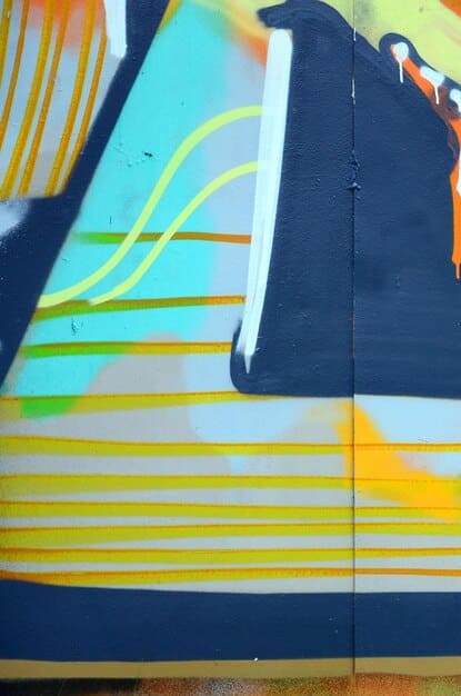
One striking example is the use of blue and orange, a classic complementary pair, in many large-scale pieces. Artists often utilize a dominant blue background to create depth and a sense of calm or mystery, then introduce vibrant orange figures or intricate lettering that immediately pop, creating a focal point that draws the viewer’s eye.
This creates a vivid juxtaposition, where the cool tranquility of blue enhances the fiery energy of orange, and vice versa. It’s a dynamic interplay that makes the entire composition feel more alive and impactful, demonstrating how two colors, when paired strategically, can elevate each other’s visual presence significantly.
Analyzing impactful blue and orange compositions
Many urban artists have masterfully employed the blue and orange complementary scheme to create visually arresting murals. These compositions often play with varying intensities and proportions of the two colors, demonstrating a nuanced understanding of their interaction.
- Depth and Focus: Artists use deeper blues for backgrounds or larger elements, allowing brighter, more saturated oranges to stand out as foreground elements or intricate details, creating a layered visual experience.
- Emotional Resonance: The blue often conveys stability, wisdom, or coolness, while orange can represent enthusiasm, warmth, or energy. Their combination allows for a complex emotional narrative within the artwork.
- Environmental Integration: In some cases, the blue might reflect the sky or water elements in the urban environment, with orange drawing attention to human activity or man-made structures, creating a dialogue with the surroundings.
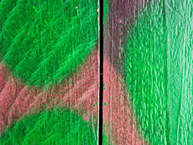
Another powerful complementary pair frequently observed in graffiti is red and green. While challenging to balance due to their association with holiday themes, when used skillfully, they can create incredibly vibrant and energetic pieces. A deep, earthy green might serve as a striking backdrop for crimson or scarlet elements, giving the mural an organic yet fierce aesthetic.
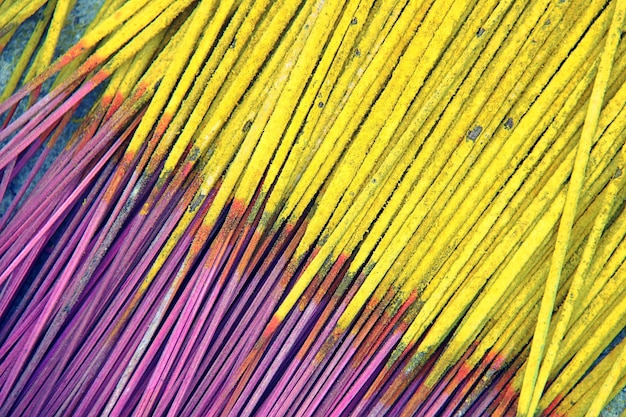
Similarly, the purple and yellow combination offers a unique appeal. Yellow, being an energetic and bright color, can be grounded by the regal and often mysterious nature of purple. This pairing can evoke feelings of royalty, fantasy, or even a whimsical surrealism, making murals that utilize them distinctly memorable.
By studying these celebrated examples, aspiring and established graffiti artists alike can glean practical strategies for deploying complementary colors. These case studies underscore that the effective use of color is not just about aesthetics, but about constructing powerful visual narratives that resonate with the viewer and the urban landscape.
Beyond the basics: Advanced color techniques for murals
While understanding complementary colors is fundamental, true mastery in graffiti art involves weaving in more advanced color techniques. These methods allow artists to add layers of complexity, subtlety, and sophistication, moving beyond stark contrasts to create nuanced and deeply engaging murals.
One such technique is the use of analogous colors, which are groups of three colors that are next to each other on the color wheel. These color schemes are harmonious and pleasing to the eye, as they share a common dominant color. Introducing a complementary accent within an analogous scheme can create a single, powerful focal point that truly stands out against a harmonious backdrop.
For instance, an artist might use various shades of blue, blue-green, and green to create a serene landscape. Then, a small, vibrant orange element—perhaps a character or a specific detail—is introduced to provide a burst of energy and draw immediate attention. This offers a softer contrast than a purely complementary scheme, adding visual depth and interest without overwhelming the viewer.
Exploring split-complementary and triadic color schemes
Diving deeper into the color wheel reveals more complex, yet equally impactful, schemes that offer greater versatility. These provide artists with expanded options for achieving balance and dynamic appeal in their murals.
- Split-Complementary Scheme: This scheme uses a base color and the two colors adjacent to its complement. For example, if your base color is blue, instead of using orange (its direct complement), you would use yellow-orange and red-orange. This offers a high degree of contrast while being less jarring than a direct complementary pair, providing more range and nuance.
- Triadic Scheme: A triadic color scheme involves three colors that are equally spaced on the color wheel, such as red, yellow, and blue, or orange, green, and purple. These schemes are vibrant and create strong visual harmony, offering a rich and balanced palette. They are often used to convey energy and playfulness, demanding attention in a dynamic way.
- Monochromatic with Accent: While not strictly complementary, using various shades, tints, and tones of a single color provides consistency and depth. Introducing a small, vibrant complementary accent color can then create a dramatic focal point without relying on an overall high-contrast palette.
Furthermore, manipulating value—the lightness or darkness of a color—and saturation—its intensity or purity—is critical for advanced color application. A desaturated complementary color might offer a subtle contrast, while a highly saturated one will deliver a powerful punch. Artists can play with these variables to guide the viewer’s eye and create different emotional responses within the same mural.
Considering the interplay of light and shadow, and how it affects color perception, adds another layer of sophistication. Colors can appear dramatically different under direct sunlight versus diffused light or artificial illumination. Experienced graffiti artists anticipate these changes, adjusting their palettes to ensure the mural looks its best under various conditions.
Ultimately, employing advanced color techniques allows graffiti artists to move beyond simply painting a wall and instead sculpt a powerful visual experience. It’s about orchestrating a symphony of hues that not only captures the eye but also tells a story and evokes a profound emotional response.
Common pitfalls and how to avoid them when using complementary colors
While complementary colors offer immense power in creating eye-catching murals, their misuse can lead to visual chaos or an overwhelming effect. Being aware of common pitfalls allows artists to harness this power responsibly, ensuring their work is both dynamic and visually harmonious.
One primary mistake is over-saturating both colors in a complementary pair and using them in equal proportions. This often results in a visual “vibration” that is uncomfortable to the eye, making the mural difficult to view or even causing a sense of agitation. The goal is often contrast and emphasis, not optical fatigue.
Another pitfall is neglecting the context of the mural. A bold complementary scheme that works well in a stark industrial setting might clash disastrously in a leafy suburban area. The environment, including natural light and surrounding architecture, should always inform color choices to ensure integration rather than discord.
Strategies for balancing intensity and avoiding visual clashes
Effective use of complementary colors relies on balancing their intensity and strategically applying them to avoid overwhelming the viewer. This requires a nuanced approach where one color often dominates, while its complement serves as a thoughtfully placed accent.
- Varying Saturation and Value: Instead of using two highly saturated complementary colors, desaturate one of them, or use a lighter tint or darker shade. This reduces the harshness of the contrast while maintaining the complementary relationship.
- Proportional Use: Avoid using both complementary colors in equal amounts. Typically, one color should be dominant, covering a larger area, while the other is used as a smaller accent to create focal points or highlight details.
- Introducing Neutrals: Incorporating neutral colors like grays, blacks, whites, or earthy tones can provide a visual resting place between intense complementary colors, allowing the vibrant hues to truly pop without being overwhelming.
- Considering Texture and Line Work: The way colors are applied, through texture or distinct lines, can also influence their impact. Smooth transitions or sharp edges can alter how complementary colors are perceived.
Ignoring the emotional impact of certain color combinations can also be a pitfall. While red and green are complementary, their strong association with the festive season might be entirely inappropriate for a serious or contemplative mural, leading to unintended interpretations.
Furthermore, poor execution in terms of paint application, such as uneven coverage or messy edges, can amplify the negative effects of a harsh complementary scheme. Clean lines and consistent application are crucial for allowing the colors to interact as intended.
Finally, artists sometimes forget to step back and view their work from a distance during the creation process. What looks balanced up close might appear chaotic from afar. Regular step-backs allow for crucial adjustments, ensuring the mural achieves its intended visual impact across various viewing distances.
By being mindful of these common missteps and implementing strategies for balance, graffiti artists can unlock the full potential of complementary colors, creating murals that are not only visually arresting but also harmoniously integrated into their urban canvas.
Enhancing murals: The psychological impact of complementary colors
Beyond their visual appeal, complementary colors hold significant psychological power, capable of influencing mood, guiding perception, and even evoking specific reactions from viewers. For graffiti artists, understanding this deeper impact allows for the creation of murals that are not just seen, but deeply felt and remembered.
The inherent tension created by complementary pairs can signify dynamism and energy, making a mural feel vibrant and alive. This duality can convey complex messages—for example, the contrast between struggle and triumph, or chaos and order—adding layers of meaning to the artwork. The choice of which color dominates can shift this psychological narrative significantly.
For instance, a mural that heavily features blues with hints of orange might evoke a sense of calm and introspection, punctuated by sparks of creativity or adventure. Conversely, a piece dominated by bold oranges with blue accents could convey intense energy, excitement, or even urgency, with blue providing moments of grounding.
Creating specific emotional responses and directing viewer attention
The strategic deployment of complementary colors is a sophisticated tool for emotional manipulation and visual guidance within a mural. Each pair carries its own psychological implications, which artists can leverage to create specific viewer experiences.
- Blue & Orange: Often associated with water and fire, these can evoke a sense of adventure, exploration, and dramatic tension. Blue can be calming, while orange brings warmth and vitality, creating a balanced yet exciting feel.
- Red & Green: These evoke strong primal reactions. Red signifies passion, energy, or danger, while green represents nature, growth, or tranquility. Their combination can create highly energetic and sometimes unsettling contrasts, useful for impactful political or social commentary.
- Yellow & Purple: Yellow often symbolizes happiness, optimism, or warning, while purple can convey royalty, mystery, or spirituality. Their pairing can result in compositions that are whimsical, luxurious, or even surreal, drawing viewers into an imaginative space.
The way complementary colors are used can also direct the viewer’s gaze. Our eyes are naturally drawn to areas of high contrast. By strategically placing the most vibrant complementary combinations at key points, artists can subtly guide the viewer through the narrative of the mural, ensuring that important details or messages are not overlooked. This visual hierarchy is crucial for effective communication in large-scale public art.
Moreover, the unexpectedness of a strong complementary contrast can trigger curiosity and encourage closer inspection. It makes a mural memorable, standing out from its surroundings and fostering a deeper engagement from the audience. This memorability is vital for art intended to provoke thought or inspire action.
In conclusion, incorporating the psychological impact of complementary colors allows graffiti artists to transform their murals into powerful communicators. It moves the art from mere decoration to a nuanced dialogue with the viewer, evoking specific emotions and lingering impressions long after the initial viewing.
| Key Aspect | Brief Description |
|---|---|
| 🎨 Color Theory Basics | Understand the color wheel, primaries, secondaries, and tertiaries to form harmonious palettes. |
| ✨ Complementary Power | Opposite colors on the wheel, creating maximum visual contrast and vibrancy. |
| ⚖️ Balance & Harmony | Use one dominant color and its complement as an accent for striking, yet balanced, murals. |
| 🧠 Psychological Impact | Complementary pairs evoke specific emotions and guide viewer attention effectively. |
FAQs about using complementary colors in graffiti art
The most frequently used complementary color pairs in graffiti are red and green, blue and orange, and yellow and purple. These pairs offer high contrast, making elements pop and creating dynamic visual effects on large surfaces.
To avoid clashing, use one color as a dominant hue and its complement as an accent. Vary the saturation and value of each color, or introduce neutral tones like black, white, or gray to provide visual calm and help the vibrant colors stand out without overwhelming.
No, complementary colors don’t always have to be bright. You can use tints (add white), shades (add black), or tones (add gray) of complementary colors to create more subtle or subdued contrasts. This allows for a wider range of moods and effects in your murals, from vibrant to earthy or moody.
While technically possible, using more than one primary complementary pair in a single mural can be challenging to balance and might lead to visual confusion. It’s often more effective to master one pair at a time or explore split-complementary or triadic schemes for more complexity with better harmony.
The background color is extremely important. It sets the stage for your complementary colors. A neutral background can make them pop more, while a background that is part of a complementary pair itself can intensify the overall visual impact, contributing significantly to the mood and focus of the mural.
Conclusion
Mastering the intricacies of


