Mastering Calligraphy Caps: 6 Advanced Stroke Angles for Sharp Handstyles
Advertisements
Calligraphy caps become more expressive when artists understand how a broad or chisel edge changes the weight, contrast, and rhythm of each stroke.
Instead of treating specific angles as fixed rules, lettering artists can use several positions as exercises for exploring structure and visual character.
The six angles below provide practical reference points for developing sharper capitals, handstyles, and chisel-marker lettering with greater consistency.
Understanding Stroke Angles in Calligraphy Caps
Broad-edge lettering creates thick and thin strokes primarily through the shape and orientation of the writing edge rather than heavy pressure.
Keeping the tool at a consistent angle helps maintain predictable contrast as vertical, horizontal, diagonal, and curved strokes move across the page.
Changing that orientation deliberately can alter the personality of the letterform, producing anything from balanced classical shapes to highly stylized forms.
The Difference Between Pen Angle and Tool Position
Pen angle can describe how the broad edge is oriented relative to the writing line, which directly influences stroke width.
The physical angle between the tool and writing surface also affects comfort, ink flow, and how securely the nib contacts the material.
Practicing these two variables separately helps artists understand why identical movements can produce noticeably different results with the same marker.
Why Consistency Matters
A consistent edge orientation creates visual rhythm because similar strokes repeat with predictable weight throughout a word or composition.
Unintentional rotation can make one letter appear heavier than another, even when the same movement and pressure are used.
Developing muscle memory allows artists to maintain the desired angle naturally while concentrating more attention on spacing and letter construction.
Building a Strong Foundation
Before experimenting with extreme angles, artists benefit from practicing basic strokes, straight lines, curves, and simple capital letter structures.
Broad-edge calligraphy rewards controlled movement because the contrast is generated naturally when the edge remains properly oriented during each stroke.
This foundation makes later experimentation more intentional and reduces the tendency to compensate for weak technique with excessive pressure.
Pressure, Movement, and Edge Control
Unlike pointed-pen calligraphy, broad-edge lettering does not normally depend on strong pressure changes to create its fundamental thick-and-thin contrast.
The broad shape of the edge performs much of that work, allowing the artist to focus on direction, speed, spacing, and consistency.
Pressure can still influence texture and ink delivery, but it should not replace controlled edge orientation when constructing clean letterforms.
Common Beginner Mistakes
Beginners often rotate the marker unconsciously while forming curves, causing the stroke contrast to change unexpectedly inside the same letter.
Another common problem is concentrating only on individual strokes while ignoring spacing, negative space, baseline alignment, and overall proportion.
Slower practice usually produces faster improvement because it gives the artist time to observe how the edge behaves throughout each movement.
Keep the chisel edge stable during basic drills.
Practice parallel strokes before complete alphabets.
Observe negative space between letters.
Avoid using excessive pressure to force contrast.
Six Useful Stroke Angles to Practice
There is no universal system declaring six angles to be official standards for advanced lettering or graffiti-inspired calligraphy.
However, practicing several orientations can teach how a chisel edge changes stroke weight and help artists develop stronger visual awareness.
The following angles should therefore be treated as creative exercises rather than rigid rules that every lettering style must follow.
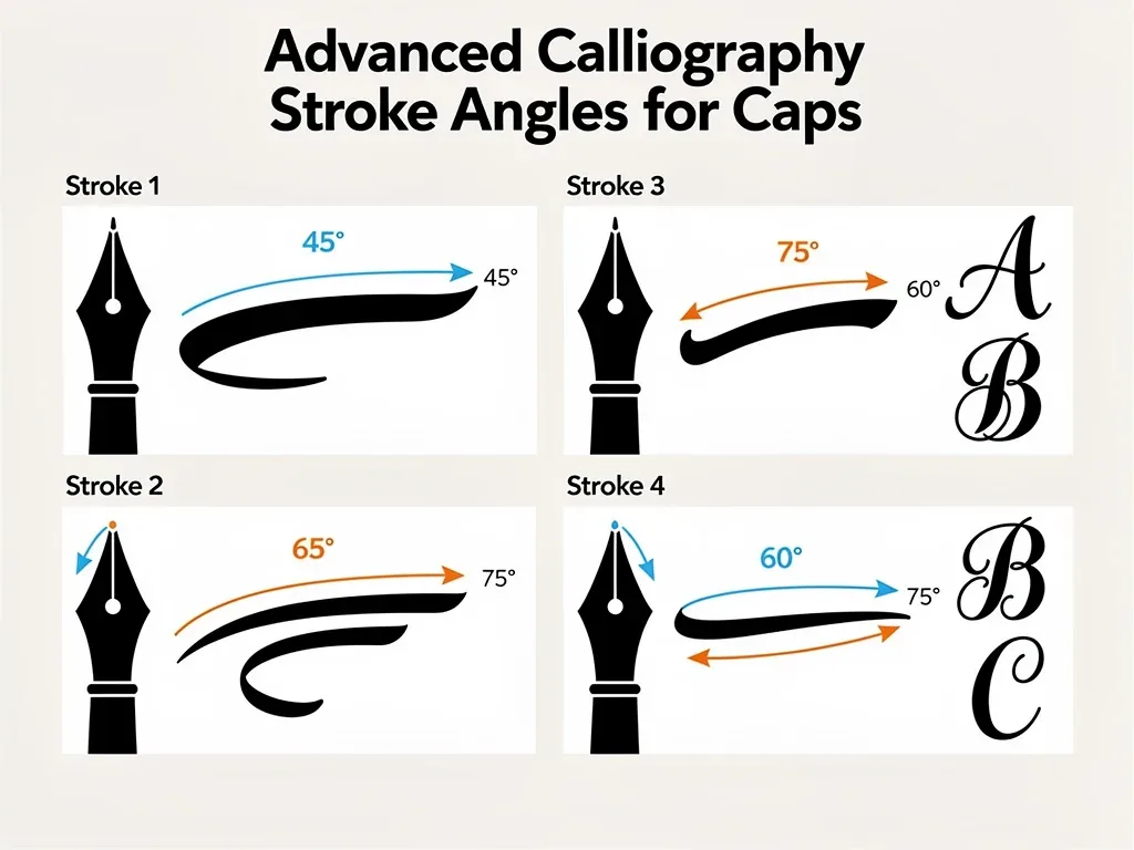
Angle 1: Steep Orientation Around 75 Degrees
A steep edge orientation emphasizes one direction strongly and can create narrow contrasting strokes alongside heavier opposing movements.
This produces a compressed visual character that can work well when experimenting with tall capitals or tightly structured lettering.
The challenge is maintaining the steep orientation during curves because even small rotations can noticeably alter the stroke weight.
Angle 2: Classic 45-Degree Orientation
A 45-degree orientation is commonly used in broad-edge calligraphy because it creates a clear and balanced relationship between thick and thin strokes.
It provides a useful starting point for practicing consistent capitals before moving toward more exaggerated or experimental positions.
Because the contrast remains relatively balanced, artists can concentrate on proportion, spacing, rhythm, and clean construction without extreme distortion.
Angle 3: Lower Orientation Around 30 Degrees
Lowering the broad edge changes the relationship between horizontal, vertical, and diagonal strokes, creating a noticeably different visual rhythm.
A position around 30 degrees can encourage wider-feeling forms and more energetic horizontal movement depending on the letter construction.
It works especially well as a comparison exercise against 45 degrees because the difference in stroke distribution becomes immediately visible.
Using More Extreme Angles
More extreme orientations can produce dramatic effects, but they also make inconsistencies easier to see when the marker rotates accidentally.
These positions are better treated as stylistic experiments after basic edge control and spacing have become reasonably comfortable.
Artists can compare identical letters at different angles to understand which orientation best supports the intended visual personality.
Angle 4: Shallow Orientation Around 15 Degrees
A shallow edge position can create broad horizontal emphasis while making strokes moving in other directions appear considerably narrower.
The resulting form can feel wide, grounded, and graphic, especially when used with large capitals or bold chisel-marker lettering.
Because the contrast becomes more extreme, careful spacing is important to prevent neighboring letters from visually merging together.
Angle 5: Reverse Orientation Around 135 Degrees
Rotating the edge into a reverse orientation changes the familiar distribution of thick and thin strokes found in many broad-edge alphabets.
This can produce unusual letterforms that feel intentionally inverted, experimental, or visually disruptive compared with traditional construction.
Reverse orientations require deliberate control because normal writing habits often encourage the hand to rotate back toward more familiar positions.
Practice the reverse angle slowly before increasing speed.
Compare identical capitals in normal and reverse orientations.
Watch for unintended marker rotation through curves.
Prioritize readability before adding decorative complexity.
Angle 6: Near-Horizontal Orientation
A near-horizontal chisel orientation creates another extreme contrast and can reduce the visual weight of certain vertical movements considerably.
This position is useful for studying how far a letterform can be pushed before its structure becomes difficult to read.
Rather than treating it as a standard angle, artists can use it as an experiment for developing unusual display lettering.
Combining Angles Within a Personal Style
Experienced lettering artists sometimes change edge orientation intentionally to create contrast between sections of a word or decorative elements.
These changes work best when they appear controlled, because random rotation can make the composition look inconsistent rather than expressive.
Understanding traditional broad-edge principles gives artists a stronger foundation for bending those principles deliberately in contemporary graffiti art.
Changing Angles Without Losing Structure
When shifting orientation, maintain consistent letter height, spacing, baseline position, and overall proportions so the word still feels unified.
Angle changes can then become accents rather than disruptions, drawing attention to selected strokes, terminals, or decorative movements.
Practicing the transition separately helps prevent the hand from rotating unintentionally during sections that should remain consistent.
Developing a Recognizable Handstyle
Personal style develops through repetition, observation, experimentation, and gradual refinement rather than by simply selecting an unusual marker angle.
Letter proportions, connections, rhythm, spacing, terminals, speed, and repeated structural decisions all contribute to a recognizable visual identity.
Angles are therefore one component of handstyle development, useful when combined with broader control over the entire lettering system.
Tools for Practicing Calligraphy Caps
Broad-edge pens, flat brushes, chisel markers, and digital brushes can all help artists understand how edge orientation affects letterforms.
Different tools produce different amounts of friction, flexibility, ink flow, and edge sharpness, so practice should include several surfaces.
A tool that feels predictable makes it easier to study angles because changes in the result are less likely to come from equipment problems.
Choosing a Chisel Marker
A firm chisel tip usually provides clearer feedback when practicing angles because the edge maintains its shape during repeated strokes.
Different nib widths also change the relationship between letter height and stroke thickness, influencing how compact or open the alphabet appears.
Testing several sizes on paper helps identify a comfortable combination before working on larger or more textured practice surfaces.
Choosing Practice Surfaces
Smooth paper is useful for controlled drills because the marker moves predictably and small inconsistencies are easy to identify.
Cardboard and other disposable textured materials can introduce additional friction while still providing a legal and inexpensive practice surface.
Digital tablets offer another option for experimenting with edge orientation, especially when the software supports realistic broad-edge brushes.
Use smooth paper for controlled technical drills.
Try cardboard for additional texture and resistance.
Use digital broad-edge brushes for repeated experiments.
Practice only on surfaces where you have permission.
Practicing Letterforms More Effectively
Repeatedly drawing full alphabets can help, but focused drills often reveal technical problems more quickly than long practice sessions.
Artists can isolate verticals, horizontals, diagonals, curves, and transitions before combining them into complete capital letterforms.
This method makes it easier to identify whether inconsistency comes from angle control, movement, spacing, or the shape of the marker.
Use Angle Guides
Light reference lines can help establish the intended edge orientation until the hand becomes comfortable maintaining it without visual assistance.
Practice several identical strokes beside one another and compare their widths rather than judging each mark individually.
Once consistency improves, remove the guides gradually and test whether the same orientation can be reproduced from muscle memory.
Compare the Same Letter at Different Angles
Writing the same capital at 45, 30, and 15 degrees makes the effect of edge orientation much easier to understand.
The exercise separates stylistic differences from differences caused by letter construction because the underlying character remains the same.
Photographing the results can also make subtle changes in weight, spacing, and proportion easier to evaluate after practice.
Learning From Calligraphy and Street Lettering
Studying established calligraphers and lettering artists can reveal how rhythm, structure, spacing, and edge control work together within finished compositions.
The goal is not to reproduce another artist's signature but to understand why certain construction choices create clarity, tension, or movement.
Comparing traditional broad-edge lettering with contemporary handstyles can reveal how older techniques continue to influence newer visual languages.
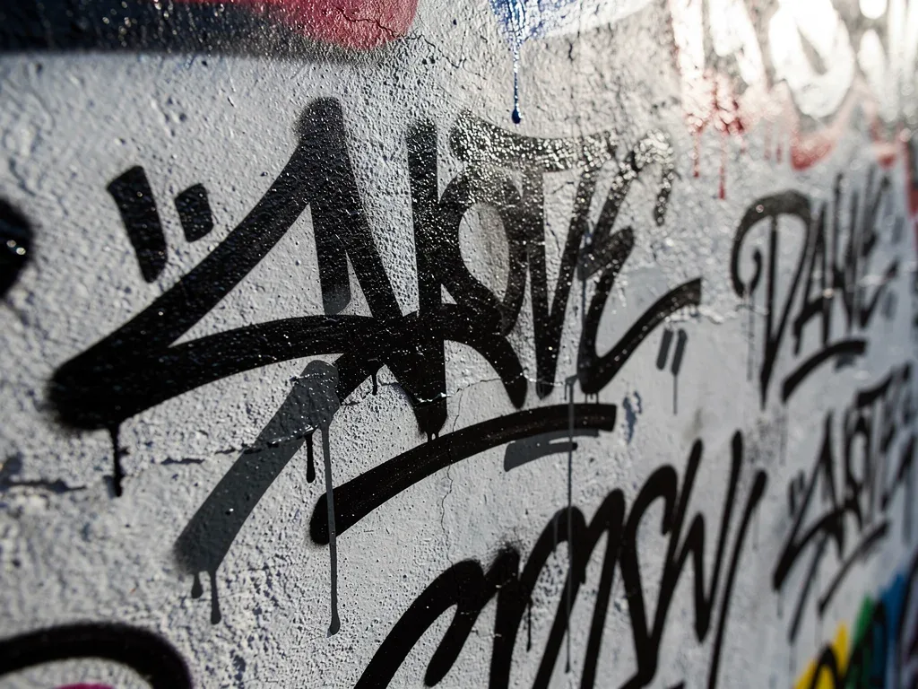
Chaz Bojórquez and Calligraphic Influence
Chaz Bojórquez is widely associated with the development of Cholo writing as a recognized artistic language within Los Angeles graffiti culture.
His work combines influences from East Los Angeles lettering traditions with his study of Asian calligraphy and an emphasis on disciplined brushwork.
His career demonstrates how calligraphic principles can inform contemporary lettering without requiring a fixed set of prescribed stroke angles.
Analyze Structure Instead of Copying Signatures
When studying another artist, examine baseline rhythm, stroke contrast, proportions, spacing, repetition, and the relationship between positive and negative space.
This analytical approach teaches transferable skills without turning practice into direct imitation of another person's identifying lettering style.
Artists can then apply those observations to their own alphabets and develop original solutions through experimentation and repeated refinement.
Legal and Ethical Practice
Calligraphy-inspired handstyles can be practiced on paper, sketchbooks, canvases, boards, digital surfaces, or walls where permission has been obtained.
Working legally gives artists the freedom to practice slowly, document experiments, and revisit compositions without the pressure of unauthorized activity.
Understanding broader ethical considerations for graffiti artists also helps separate artistic technique from questions about where work is created.
Street Art and Property Rules
The artistic quality of lettering does not determine whether placing it on a particular surface is lawful or authorized.
Property ownership, permission, local laws, and specific circumstances determine whether a mural, tag, or other intervention is legally permitted.
The distinction between graffiti art and vandalism therefore depends on more than style or technical sophistication.
Documenting Original Work
Photographs, dated sketches, practice sheets, and digital files can help artists document the development of their own lettering systems.
This archive also makes progress easier to evaluate because older versions can be compared against newer experiments and refinements.
Documentation becomes particularly useful when discussing attribution, provenance, or authentication of graffiti art in professional contexts.
Digital Tools and the Future of Lettering
Digital drawing tools allow lettering artists to experiment rapidly with edge widths, stroke orientations, spacing, and composition without consuming physical materials.
Pressure-sensitive tablets and customizable brushes can simulate some characteristics of broad-edge tools while offering easy correction and duplication.
They do not perfectly reproduce every physical surface, but they provide a useful environment for studying structure and testing variations.
Moving Between Physical and Digital Practice
Physical tools provide resistance, ink behavior, and tactile feedback that digital brushes cannot reproduce in exactly the same way.
Digital tools provide unlimited repetition, layers, guides, and rapid variations that make them valuable for planning and experimentation.
Combining both approaches can help artists understand how a lettering concept changes when transferred between different media.
How Technology Expands Street-Art Lettering
Digital workflows can support sketches, projections, typography studies, portfolio development, documentation, and collaborative planning for authorized projects.
Artists can test several letter arrangements before committing to a physical surface, reducing material waste and improving compositional preparation.
This ongoing digital evolution of street art expands available tools without replacing the importance of fundamental lettering control.
Practice Angle | Visual Effect |
|---|---|
Around 75° | Steep contrast with a compressed visual character. |
Around 45° | Balanced broad-edge contrast and strong readability. |
Around 30° | Lower orientation with more directional movement. |
Around 15° | Shallow orientation with stronger horizontal emphasis. |
Around 135° | Reverse contrast for experimental letter construction. |
Near Horizontal | Extreme contrast for highly stylized experiments. |
Frequently Asked Questions About Calligraphy Cap Angles
Is 45 degrees the only correct angle for broad-edge calligraphy?
No. Around 45 degrees is common in several broad-edge styles, but the appropriate edge angle depends on the script and intended letterform.
Are there officially six advanced stroke angles?
No. The six angles in this guide are practice references designed to demonstrate how changing edge orientation affects broad-edge lettering.
Should I change pressure to create thick and thin strokes?
With broad-edge tools, much of the contrast comes naturally from the shape and angle of the edge rather than major pressure changes.
What is the best marker for practicing calligraphy caps?
A firm chisel-tip marker that produces consistent ink flow is a practical starting point, with width chosen according to the desired letter size.
Can I combine different angles in one word?
Yes. Deliberate angle changes can create stylistic contrast, although maintaining spacing and structure helps keep the composition visually coherent.
Where should I practice graffiti-inspired lettering?
Use sketchbooks, paper, canvas, boards, digital tools, or physical surfaces where you have clear permission to create the work.
Looking Ahead
Mastering calligraphy caps is less about memorizing fixed degrees and more about understanding how edge orientation shapes every stroke.
Practicing different angles builds control while teaching artists how weight, spacing, proportion, and rhythm interact across complete letterforms.
As traditional calligraphy and contemporary lettering continue to overlap, these fundamentals remain valuable for developing sharper and more original work.